Four ways people ask for one.
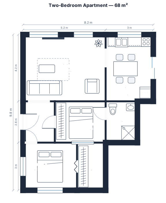
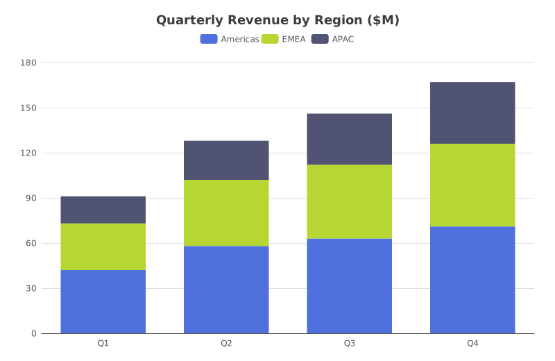
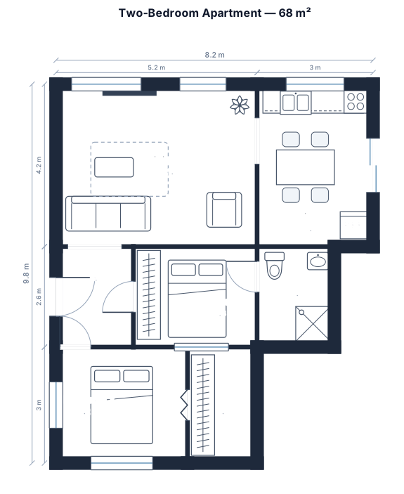
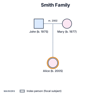
Same tool, four requests. Every drawing below is a real render.
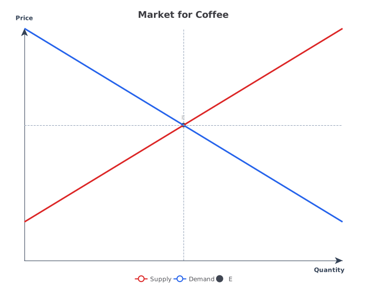
What a supply and demand graph is.
Two lines on price against quantity. Supply rises because producers offer more at a higher price; demand falls because buyers take less. Where they cross is the equilibrium: the price and quantity the market settles at.
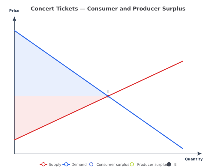
You give the two curves in words or as equations. The crossing point, and the surplus areas if you want them, are calculated for you, so the graph is right and not just close.
- Editable
- Describe the change
- Export
- SVG · PNG · PDF
Made for the people who have to be right.
Economics studentsThe graph a problem set asks for, with the equilibrium exactly where the equations put it.
Teachers and TAsA clean textbook figure for slides and handouts, with or without the numbers.
 Analysts and writers
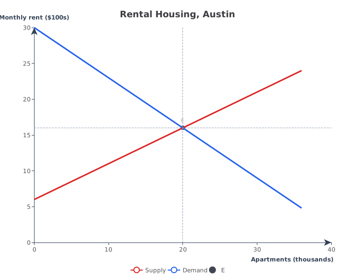
A market explained in one picture, with real units on the axes.
Three steps, no drawing tool to learn.
Describe it
One paragraph is enough to start.
See the drawing
Drawn by the right engine.
Say what changes
Every edit keeps a version.
Common questions
Do I need to know the equations?
No. “Supply starts low and rises, demand starts high and falls” is enough for a textbook graph. Give numbers when you want the equilibrium to be exact.
Can it shade consumer and producer surplus?
Yes. Ask for it and both areas are filled between the curves and the equilibrium price.
Can it show a shift in demand or supply?
Not yet. It draws one supply and one demand curve per graph. To compare, make a second graph with the new curve.
What other economics graphs can it draw?
AD–AS, IS–LM, the production possibility frontier, the Laffer curve, firm cost curves, the Phillips curve and any y = f(x) function plot.
Is it free?
You can start with a free account, no card. Exports have no watermark.
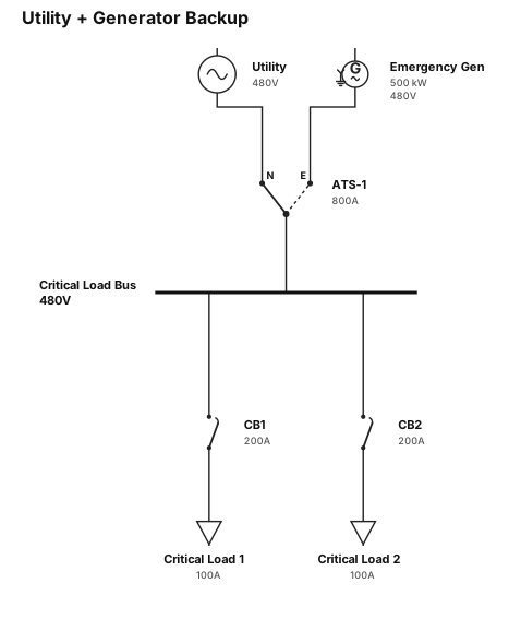
Other drawings for the same work.

Draw your first market now.
Free account, no card. Describe the two curves and see the graph in under a minute.
Open the editor